Cheap Printing VS Quality Printing
High-quality printing offers sharp details, vibrant, accurate colors, smooth gradients, and durable materials for a professional look, while cheap printing often uses lower-grade paper/ink, resulting in dull colors, pixelated text, smudging, and poor longevity, ultimately costing more in reprints and damaging brand image.
The key difference lies in resolution, ink/toner quality, paper type, and color management, with quality choices enhancing professionalism and cheap options sacrificing these for lower upfront cost.
Quality Printing (Professional/High-End)
Appearance: Crisp text, vibrant, accurate colors (within 2%), smooth tonal transitions, deep blacks, and high detail.
Materials: Premium paper (even card stock), high-grade inks/toners that adhere well and resist fading/smudging.
Durability: Longer lifespan, resisting wear and tear.
Benefits: Conveys professionalism, builds trust, creates a stronger brand impression, and can be more cost-effective long-term due to fewer reprints.
Cheap Printing (Budget/Low-End)
Appearance: Muted or inaccurate colors, fuzzy text, visible pixelation, poor color blending, and potential banding.
Materials: Lower-grade paper that absorbs ink unevenly, cheaper inks that might smudge or fade quickly.
Durability: Prints can smudge easily, fade, or degrade faster.
Drawbacks: Can look unprofessional, cheapen a brand, and lead to costly reprints, making it a false economy.
Factors Driving the Difference
Hardware: Higher resolution printers produce finer details.
Ink/Toner: Quality inks offer better color, consistency, and permanence; third-party or cheap inks can ruin profiles.
Paper: Smooth, appropriate paper absorbs ink correctly; cheap paper can bleed or look dull.
Color Management: Professional profiles ensure colors match the original design accurately.
In short, quality printing invests in better materials and technology for superior results, while cheap printing cuts corners, impacting the final look, feel.
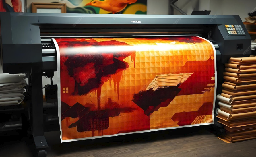
At Diamond Xpress our goal is quality printing that ensures the final output is professional.
You may also like

No Sales? Check Your Branding And Make The Sales Happen

The Surface Pro is a 2-in-1 Powerhouse Built With AI